Obscuring the Video Timeline
Android users watching videos on the YouTube mobile app recently encountered a frustrating interface flaw that literally blocks their view of the crucial playback progress bar with intrusive watch-next suggestions.
Latest news
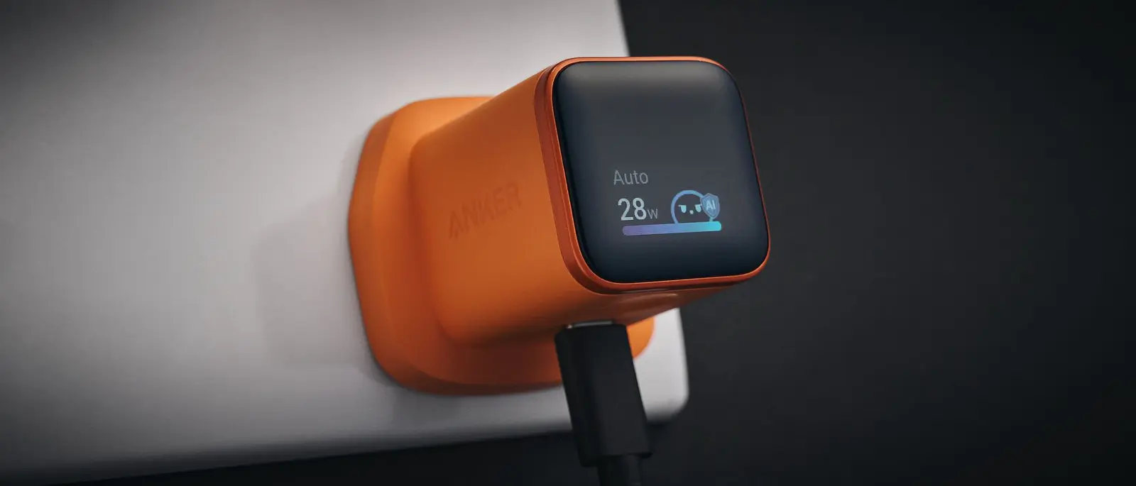 Anker Unveils Playful 45W Charger With Animated Face Display
 Google Docs Web Version Still Missing Native Dark Mode
 Anthropic-Linked Vulnerability Exploited From China, Targets US and Japan
 Text‑Based AI Agents: Your New Digital Assistants
This unexpected graphical glitch disrupts standard video navigation across numerous Android devices. Viewers attempting to scrub through content or check remaining time find their efforts blocked by overlapping recommendation elements appearing right above the control timeline.
The faulty layout behavior forces users to guess their exact position within a video. Instead of maintaining clear separation between controls and recommended clips, the platform's user interface merges these elements incorrectly.
Why Are Recommendations Blocking Controls?
Affected individuals report that the recommendation boxes render too high on the screen. This positioning directly covers the red progress indicator and time stamps, rendering standard playback adjustments nearly impossible without tapping multiple times to dismiss the overlay.
Can users still access full-screen mode to temporarily bypass this annoying visual obstruction?
Switching to landscape mode or hiding the overlay manually offers temporary relief for some viewers. However, the underlying layout bug persists during standard portrait playback, highlighting a significant oversight in recent mobile app builds.
Frequently Asked Questions
Engineers have not yet issued a public statement or deployed a hotfix to resolve this specific Android layout conflict. Users must currently endure the misplaced suggestions until an official software update restores proper spacing to the video player interface.
What causes the YouTube progress bar to disappear on Android? An interface bug causes recommendation boxes to render too high on the screen, directly covering the timeline and time stamps.
How can viewers temporarily fix this display issue? Switching to landscape mode or attempting to dismiss the overlay can help, but a permanent fix requires an app update.
Comments
Leave a comment