How Does the New Layout Improve Card Management?
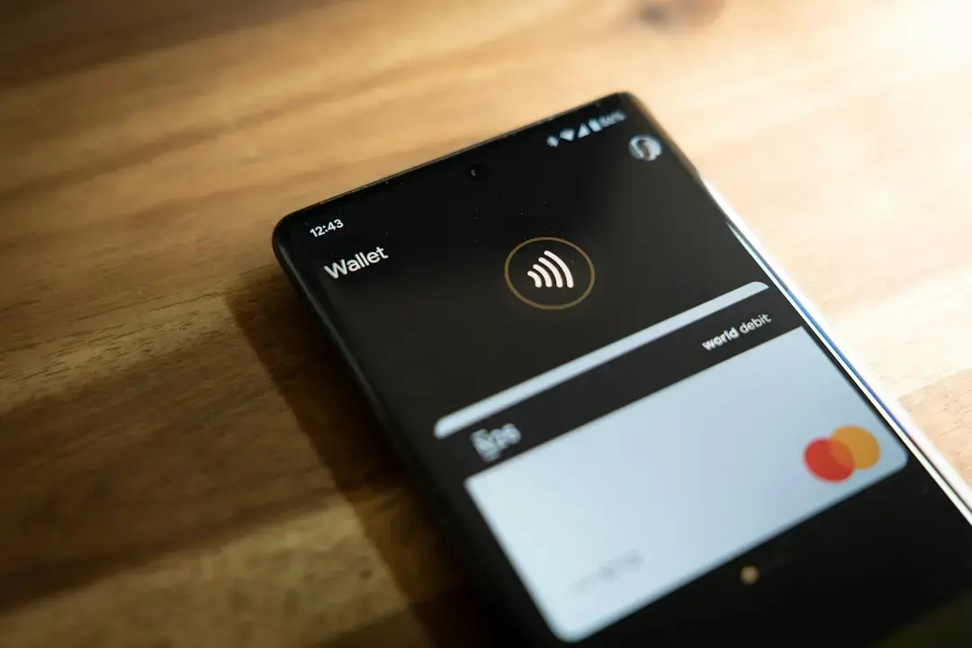
Google Wallet on Android is currently testing a redesigned interface that displays saved payment cards in a vertical list rather than a horizontal carousel. The change follows recent updates to the app’s homepage and full-screen pass views earlier this year. Users in the test group now see their credit and debit cards stacked one below the other, allowing vertical scrolling instead of swiping left or right. The update aims to improve accessibility and visibility of multiple cards without relying on edge previews. Google has not announced a public rollout date for the new layout.
Latest news
 Anker Unveils Playful 45W Charger With Animated Face Display
 Google Docs Web Version Still Missing Native Dark Mode
 Anthropic-Linked Vulnerability Exploited From China, Targets US and Japan
 Text‑Based AI Agents: Your New Digital Assistants
The current carousel design shows only a partial view of adjacent cards at the screen’s edges, requiring users to swipe repeatedly to see full details. By switching to a vertical stack, each card occupies the full width of the screen, making card numbers, expiration dates, and network logos easier to read at a glance. This format may particularly benefit users with many saved cards or those who rely on larger fonts and touch targets. The test appears to be server-side, meaning no app update is required for participants to see the change. Feedback from this trial will likely influence whether the design becomes permanent.
Could This Change Affect Other Google Wallet Features?
The vertical list reduces the need for precise horizontal swiping, which can be awkward on smaller screens or for users with motor impairments. Each card is presented as a distinct tile with consistent spacing, minimizing accidental taps. Unlike the carousel, where only one card is fully visible at a time, the stack allows quicker visual scanning. Google has not disclosed how many users are in the test or which regions are included. The company typically runs such experiments to evaluate engagement and usability before wider deployment.
While the test focuses solely on the card display, the shift may signal a broader move toward simpler, list-based navigation in the app. Passes such as boarding passes, event tickets, and loyalty cards currently use a similar carousel format and could be updated in future iterations. However, there is no indication that those sections are part of this current trial. Any future changes would likely follow separate testing phases to avoid disrupting established user workflows. Google Wallet continues to evolve as a central hub for digital credentials and payments.
Is the vertically stacked card list available to all Google Wallet users? No, the feature is currently in a limited test phase and only visible to a subset of Android users. Google has not specified how to join the test or when it might expand to everyone.
Frequently Asked Questions
Will the horizontal carousel be removed completely? There is no confirmation that the carousel will be discontinued. The test is evaluating user response, and the final design could retain elements of both layouts depending on feedback.
Does this change affect how cards are used for payments? No, the underlying functionality for tapping to pay or selecting a card remains unchanged. Only the visual arrangement of saved cards has been altered in the test.
Comments
Leave a comment